The Melanin Village
Offering comprehensive support for black and brown homeschooling families through a dedicated app

Overview
The Melanin Village (TMV) is a mobile application that offers comprehensive support for Black and Brown homeschooling families, providing moms with coaching, community, and video trainings, while offering kids self-paced classes and volunteer-led clubs, with plans for in-person groups nationwide.
I contributed to phases 3 and 4 of a six-phase project, where I was responsible for creating user flows and mid-fidelity wireframes for account management and onboarding. I later incorporated stakeholder feedback and delivered high-fidelity prototypes to TMV's development team.
The overall goal is to create a cross-platform native mobile application that serves as a community and social networking platform.
This "hub" will replace Mighty Networks and act as an entry point to The Melanin Village for both new and returning sisters, acting as a central point to resources and connection. This tool will benefit the TMV staff and Sisters by providing streamlined processes and easily digestible, accessible information.
Outcomes
$5,939
saved in development costs
16 stories
sent to development team
83%
of all stories completed
High Level Problem
The stakeholder wants to move their community from Mighty Networks to a custom app for a more tailored experience and full control over the platform.
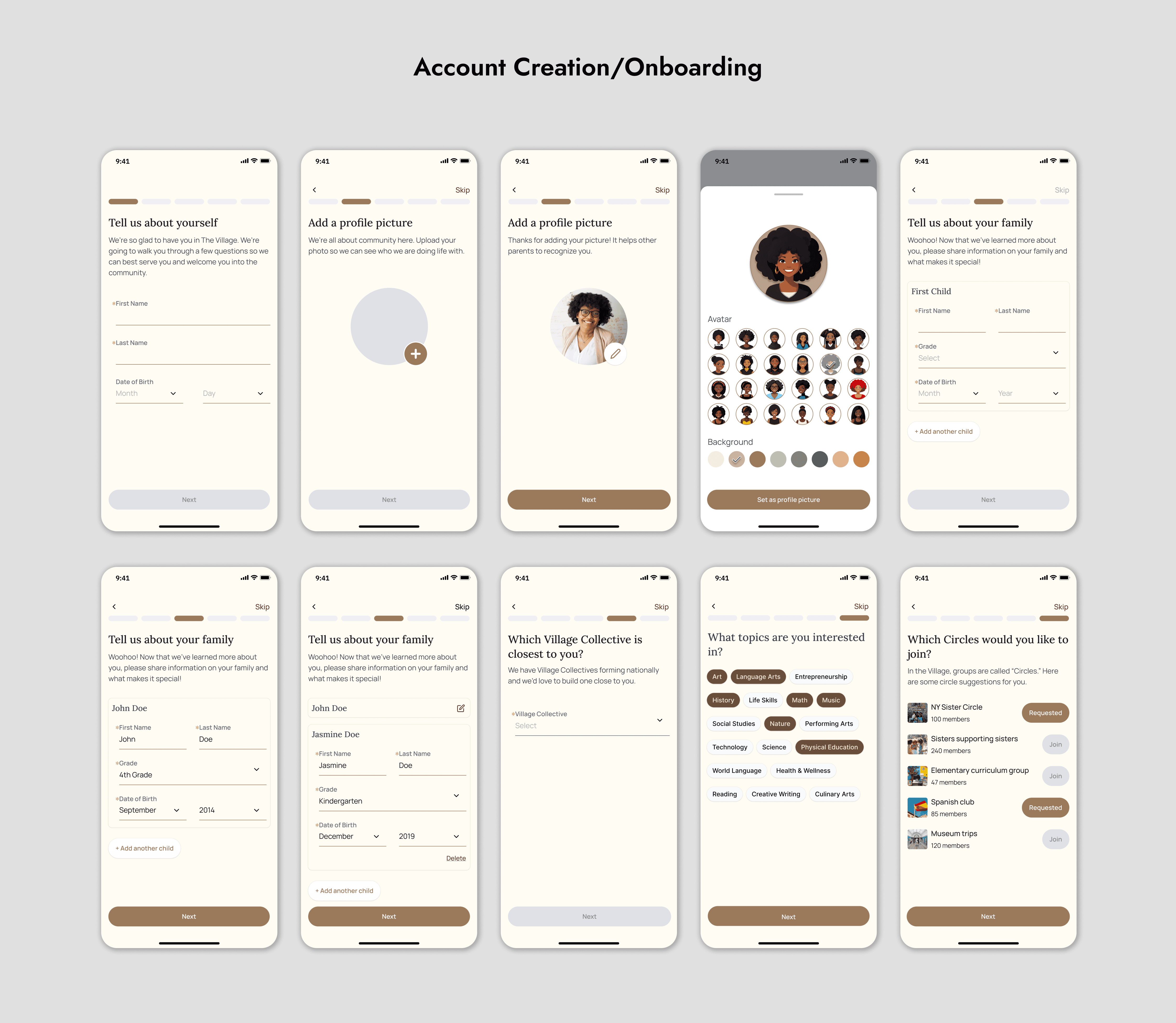
Phase 3 Objective
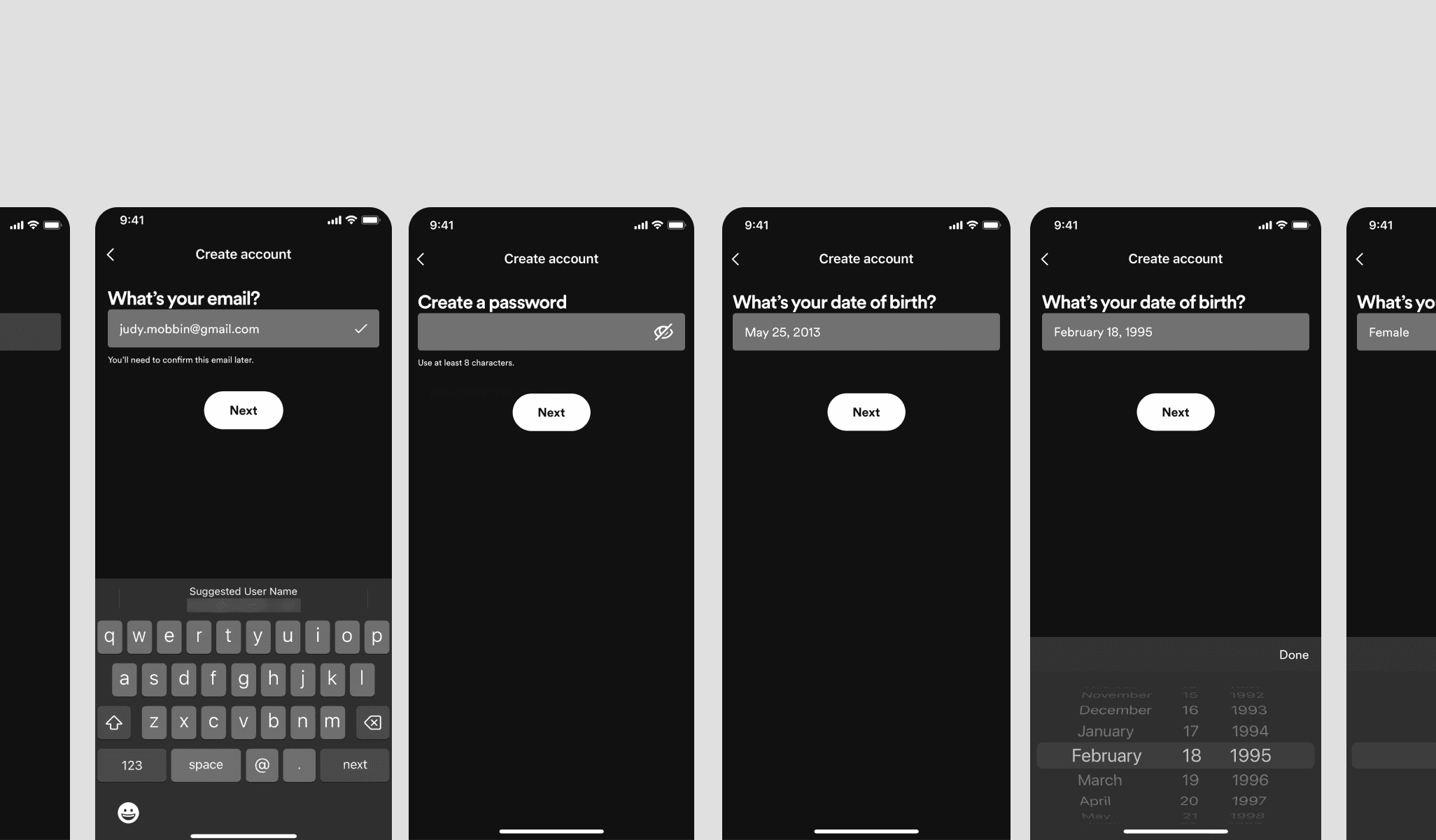
Create user flows and mid-fi wireframes for account management, settings, and onboarding.
While the broader objective was to transition the community off Mighty Networks, my task focused on ensuring that these specific screens provided intuitive navigation, streamlined user interactions, and aligned with the stakeholders' vision for the user experience within their custom app. The project included 12 stories to be completed within 8 weeks, with 3 of them designated as high priority.
Top 3 problems to tackle.
As a Sister, I want to create a profile so that I can share information about myself and connect with others
As a Sister, I want to be able to edit/customize my profile so that I can connect with others with similar interests or demographics
As a Sister, I want to have access to language and localization settings so that I can tailor my experience based on language and region.
Phase 3 Start: Onboarding, Profile Customization, and Settings
Taking inspiration from established apps.
Before diving into the design of the onboarding, profile editing, and settings flows, it was essential to explore how successful, well-established apps approached similar challenges. By analyzing industry leaders in user experience, we aimed to identify best practices and innovative features that could inform our own designs.
Multi-page onboarding
A key design choice for TMV's onboarding is multi-page onboarding, which breaks the process into manageable steps, helping users focus on one task at a time and reducing cognitive load. A progress bar complements this by offering clear visibility into progress, motivating users to complete the process. While social sign-in is standard, it further streamlines registration, ensuring users can quickly move into profile setup.
Profile picture into slide-out menu
A profile picture icon offers a familiar interaction pattern, improving navigation by grouping account-related options like settings. Tapping it triggers a slideout menu, following a standard UX pattern that reduces the learning curve. This design keeps the interface clean by hiding secondary actions and is scalable, allowing new options to be added over time without cluttering the layout.
Dedicated settings
A dedicated settings button provides quick and easy access, enhancing usability by minimizing the steps needed to manage preferences. It improves discoverability, allowing users to efficiently find important features without the hassle of navigating through multiple menus. This design promotes a smoother user experience, encouraging more frequent interaction with account management tools and ensuring users feel in control of their settings.
User Flows and Sketching
A collaborative effort to create final user flows and sketches.
The final user flow for [Onboarding/Profile Editing/Settings] was developed through a collaborative process. Various team members, including myself, contributed different iterations of the flow, and the most detailed and comprehensive version was selected. The chosen flow ensured that all key interactions and edge cases were covered, creating a seamless experience for the user. Following this were sketches which were also selected based on the same criteria.
Wireframes
Utilizing an existing design system to create wireframes
Using an existing design system, the wireframes were built by assembling pre-existing components to match the sketches. Occasionally, we introduced new components to accommodate specific design needs that arose during the sketching phase. This allowed for a streamlined process and ensured visual consistency across the app.

Phase 4 Objective
Key refinements based on stakeholder feedback.
Throughout the Phase 4, we made numerous small adjustments based on ongoing feedback, refining layout, spacing, and functionality across various screens. However, two key highlights stand out as the most significant iterations during this phase. These major changes addressed critical areas of stakeholder concern, ensuring the design aligned with both user needs and business goals.
Challenge #1: Include a reward screen during the onboarding.
Critique: Reward screen would come too early.
The stakeholder wanted a reward screen prior to inputting their children's information to encourage users to continue with onboarding. However the screens before only involved filling out personal information which was arguably the quickest part of the flow. This meant users would be presented with a reward screen only less than a minute into the onboarding.

Result: Reward screen not implemented. Stakeholder deferred to team's recommendation.
After bringing up my concern along with my reasoning to the team, we discussed and quickly came to the conclusion that a reward screen was not necessary. While the stakeholder might have felt the onboarding was long due to the way it was presented in the Figma file (dedicated screen for every interaction), in practice it was much shorter. We brought these concerns back to the stakeholder who then deferred to the teams decision.
Challenge #2: Show multiple children at once in a more compact form.
Result: Children's info now displayed in a collapsible placards for easy multi-child viewing and quick editing.
To combat the ambiguity behind the request. I implemented a best of both worlds solution based off of different iterations. With collapsible placards, users will be able to view multiple children on a single screen. Tapping the placard will cause it to expand and show their info. Multiple cards can be expanded at once although this will limit how many children can fit on a single screen before needing to scroll.
Bonus feature: Title of placards in collapsed and uncollapsed states will automatically update to first and last name as filled out in the info for easy identification.

Hi-Fi Wireframes
Updating to Hi-Fi with the help of our build partner.
Once the mid-fidelity wireframes were finalized, the transition to high-fidelity design focused on aligning the UI with the visual styles provided by our build partner. This included applying the brand’s color scheme, typography, and interactive elements like CTAs. Since we had a sample screen as a guide, this phase was straightforward and focused on ensuring consistency across the app’s screens.

Hi-Fi iteration highlights based on new feedback.
With the initial high-fidelity designs in place, following the visual styles provided by our build partner, we then entered a phase of further refinement. These hi-fi iterations focused on fine-tuning key elements based on new feedback and ensuring consistency across the entire interface. Below are a few key highlights from these hi-fi iterations.
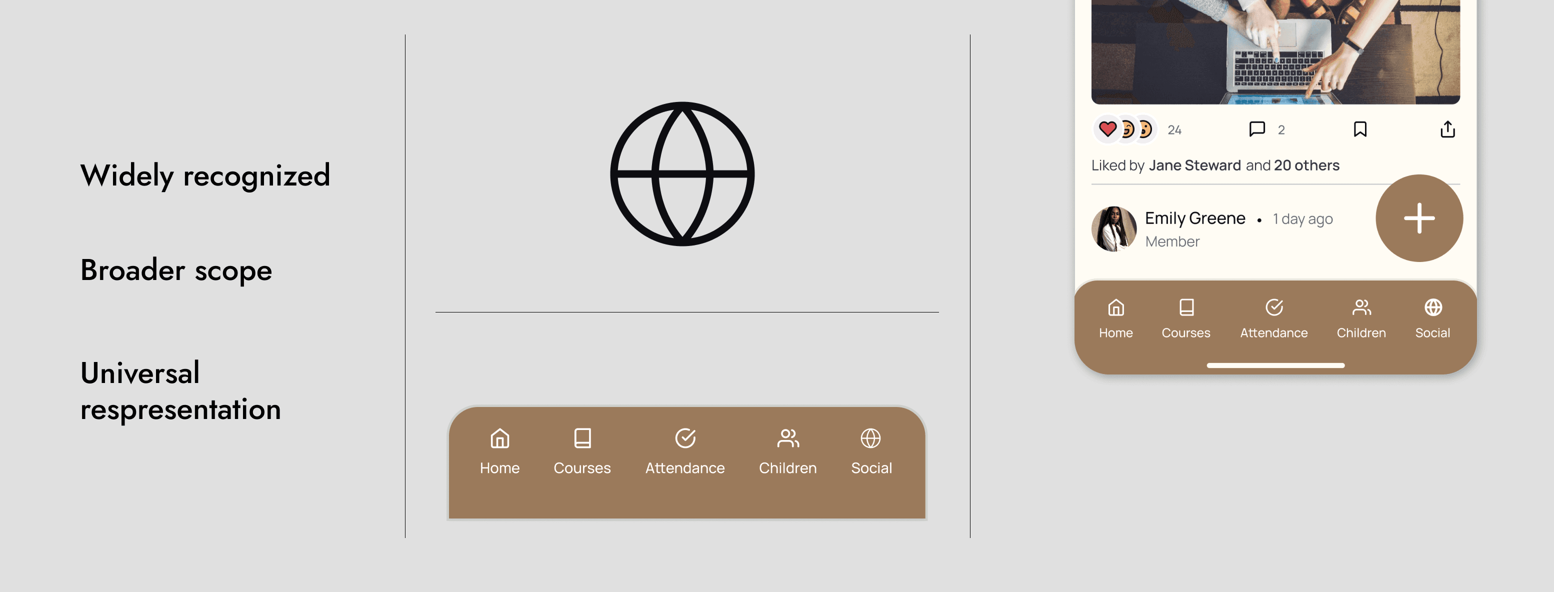
New icon for social tab due to navigation bar changes.
I proposed using a coffee mug icon to represent the new Social tab. The idea behind the coffee mug was to evoke a sense of casual, friendly, and welcoming interactions, similar to meeting friends over a cup of coffee. This symbol was intended to give the Social tab a warm, inviting feel that encouraged users to engage in informal, community-driven conversations.
Final decision: Globe icon.
While many people on the team did like the coffee mug icon, we decided to go with the globe icon. The globe symbol was chosen for its universal association with global connections and community. A large part of the decision was the broader scope it covered. The social tab was more than just a spot to chat with others but included things like events, groups, and the newsfeed.
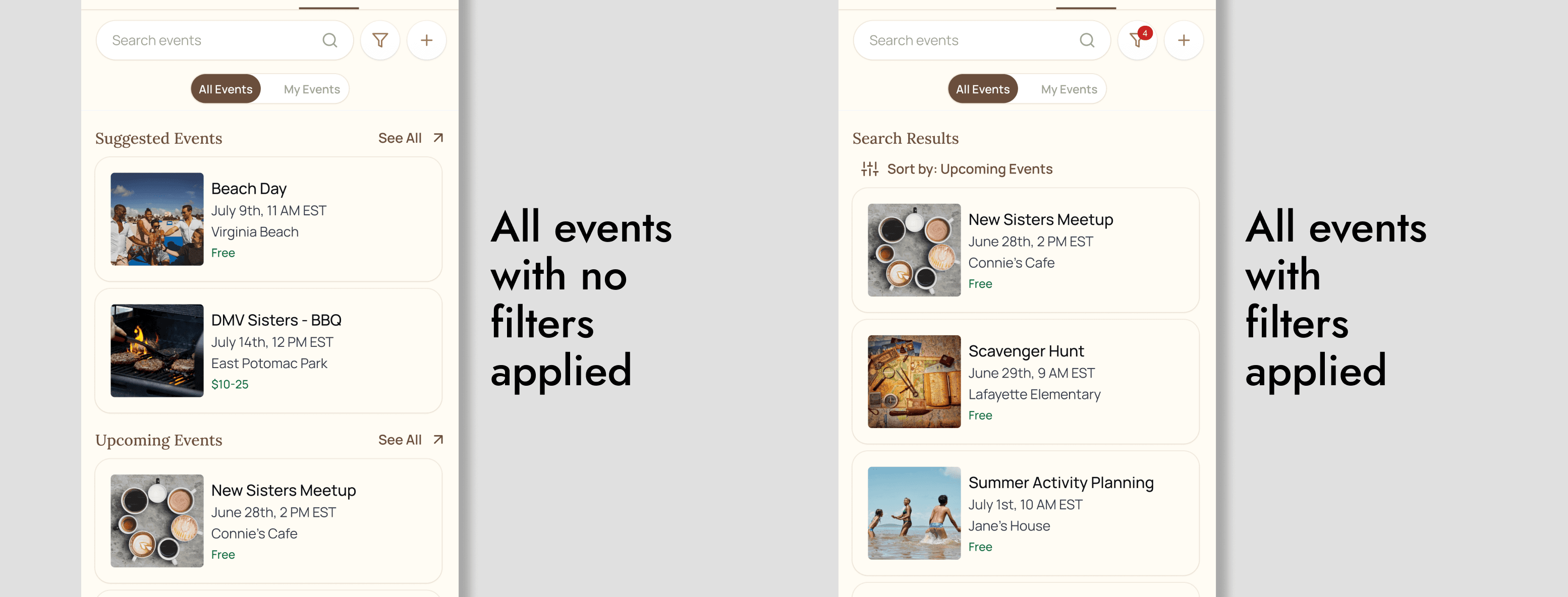
Differentiating paid and free events.
While reviewing the flow for the events page, I noticed there were filters to separate between paid and free events. However, the placard itself did not have any indicator and whether it was paid or free. This could be problematic for users as they would have to take extra steps to find out that information. Even when using filters, they could forget and not realize all their events were a single category.
Results: Small label on event placard
The solution I implemented was to include a small label below the event name that said either "free" or a pricing range if it was a paid event. In order to ensure the label wasn't lost within the other text on the placard, I changed the font color to green to help it stand out.
Final hi-fi screens sent to development: Highlights from a 16-flow project.
This case study highlights a select number of key flows I worked on, including onboarding and profile editing. While the full project involved delivering 16 different flows to development, this gallery focuses on the most representative screens to keep the presentation concise. The additional flows—such as settings, notifications, and user preferences—were part of the final handoff, developed collaboratively with the team.


Conclusion
Final results from phase 3 & 4.
What was accomplished?
$5,939
saved in development costs
16 stories
sent to development team
83%
of all stories completed
What did I learn?
User Testing
Despite the team's desire, we had no time for user testing in either phase. This made me realize how essential user testing is, especially when faced with tough design choices. It became clear that user feedback could have provided the clarity needed to validate and finalize decisions confidently.
Iteration
This project reinforced the importance of iteration in design. By continuously refining ideas and incorporating feedback early on, we were able to identify and address potential issues before they became bigger problems. Iterating not only improved the quality of the final product but also saved time in the long run by preventing costly redesigns later in development.
Collaboration
I learned the value of collaboration, especially in a distributed team across different time zones. Being able to bounce ideas off teammates improved our designs and helped us stay aligned on goals. Coordinating through clear communication and regular check-ins ensured that, despite different schedules, the team stayed on track and worked toward a shared vision.
Previous Project
BetterHunt - AI resume/customizer
Next Project
Athena - School finding app