Athena
Enabling parents to compare and analyze schools all in one location
Overview
In a world brimming with educational possibilities, parents are presented with a myriad of options when it comes to selecting the best institution for their children. This case study explores the journey of parents navigating the complex landscape of school selection and introduces Athena a mobile application tool designed to streamline the decision-making process by providing personalized school comparisons and insights.
The overall goal is to assist parents by simplifying the search for ideal educational fit.
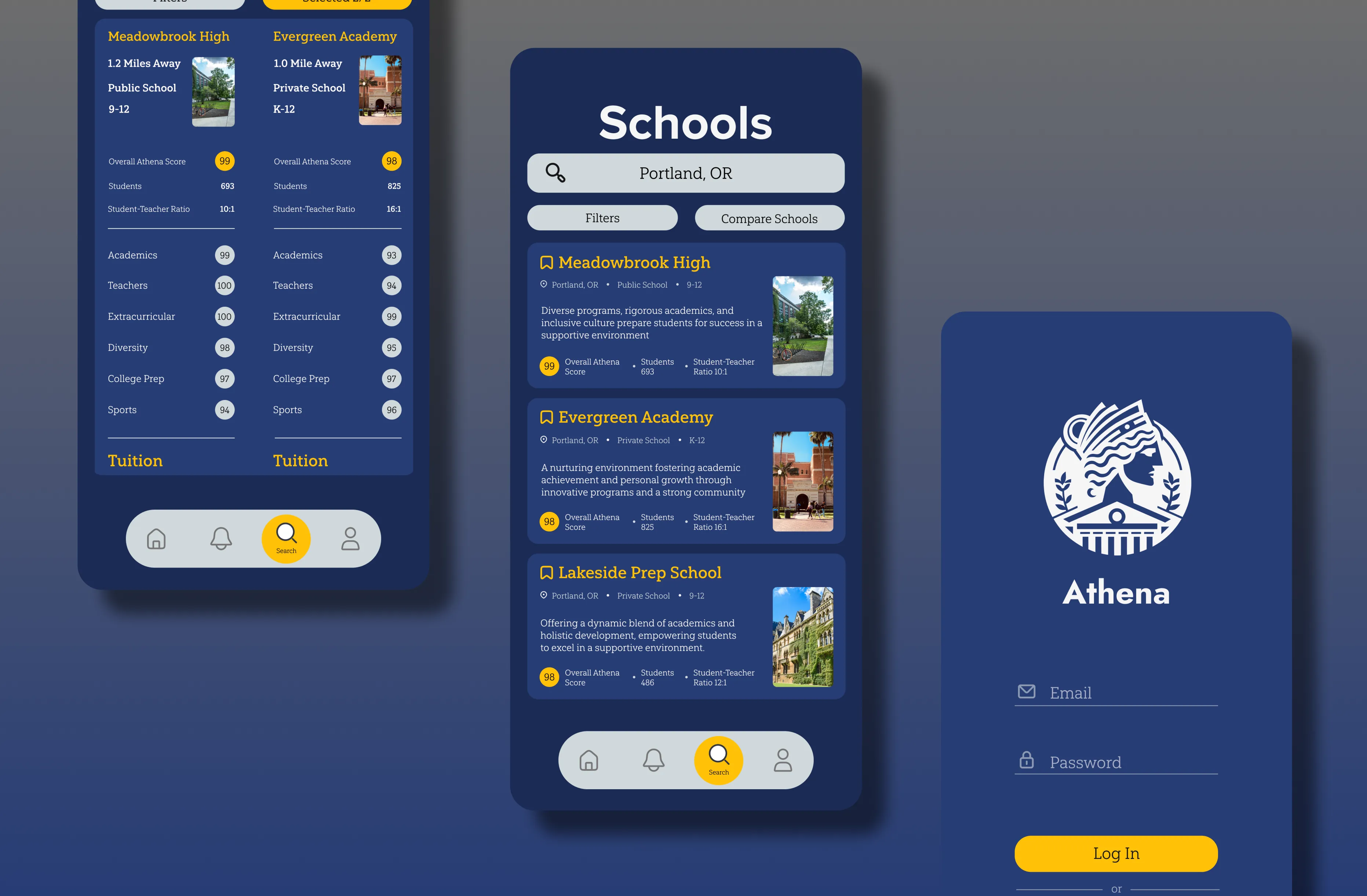
With Athena, parents will be able to easily compare data from schools utilizing a side-by-side format. Beyond overall ratings, parents will also be able to view critical information like tuition, location, and more.
Research
Identifying core pain points from 5 interview transcripts.
I began by synthesizing 5 provided user interviews and crafting an affinity map to better understand parent’s needs. From the map, I narrowed the information down to three core pain points that would drive the study forward.
Scattered Data
Parents are forced to switch between sources to collect data, which consumes time and creates frustration.
Inconsistent Metrics
Parents struggle to determine which school best fits their child’s needs, leading to uncertainty and decision fatigue.
Information Overload
With many data points to process, parents may find it hard to focus on what’s important—such as tuition, location, or teaching philosophy
Competitive Audit
How do competitors tackle these problems?
After identifying the key pain points from the research—scattered data, inconsistent metrics, and information overload—we conducted a competitive audit to explore how similar platforms tackle these challenges. This step provided valuable insights into industry standards and opportunities where Athena could improve upon existing solutions.


Refined Goal
How might we help parents analyze the data presented while displaying it in a way that is comprehensible?
Lo-fi Wireframing
Hypothesizing a side-by-side comparison concept.
Through the competitive audit, I observed how existing platforms attempted to address similar challenges. Recognizing these opportunities, I hypothesized that a side-by-side comparison feature could tackle the key pain points uncovered in the research, such as scattered data, inconsistent metrics, and information overload. This led to the creation of the first set of low-fidelity wireframes, where I explored how this feature might simplify the decision-making process for parents.
How might this concept tackle the pain points?
Consolidation
Users can see all critical data in one place
Standardization
Users can compare schools without confusion caused by varying formats
Filtration
Reduced cognitive load by hiding irrelevant information

Usability Testing
Measuring effectiveness and appeal through A/B testing.
With the lo-fi wireframes complete, the next step was to validate whether the side-by-side comparison feature tackled key challenges like scattered data, inconsistent metrics, and information overload. I performed an A/B test with 5 participants and measured task completion time and user satisfaction.
Key Learnings
54% reduction in task completion time.
The average time spent selecting a school based on their own criteria averaged 2:23 without using the comparison feature. With the comparison feature it went down to an average of 1:03, marking a significant reduction in completion time.
100% user satisfaction.
Post testing, conducted a quick survey asking participants how they felt about the comparison feature in assisting them in making a decision. All participants voted in favor of it.
Slightly confusing to use.
Due to the nature of the test, it was understood that "compare" would start initiate the comparison feature but some participants noted the wording could be better. In terms of selecting schools, the checkbox was a little small and not where they expected it to be.
Style Guide
Developing the visual identity.
With the core features validated through user testing, the next step was to develop a cohesive visual identity. The goal was to align the look and feel of the app with the intuitive user experience we aimed to deliver, ensuring that the design not only functioned well but also provided an enjoyable and seamless visual experience.

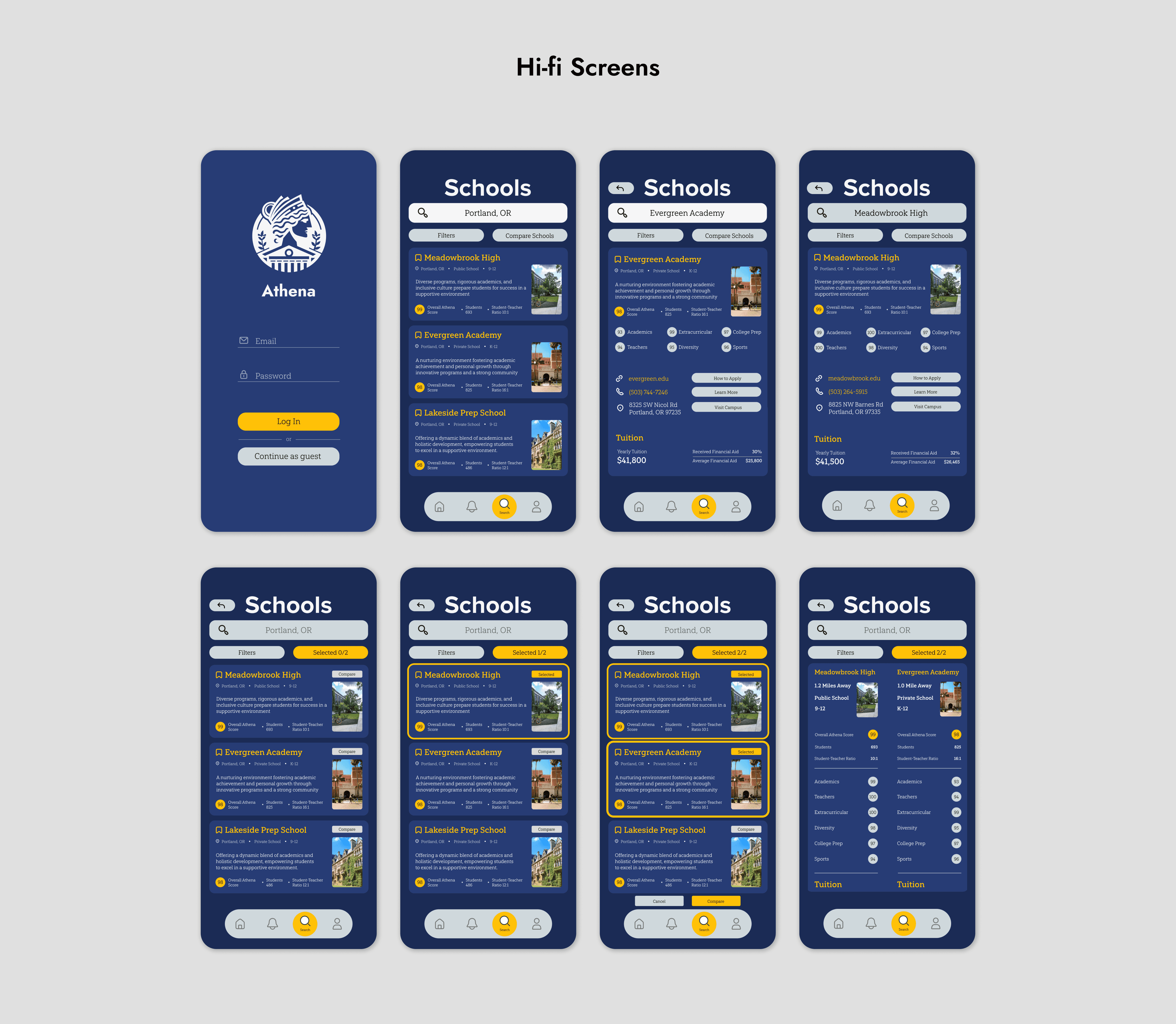
Hi-fi Testing
Testing a solution to earlier concerns.
With the high-fidelity screens complete, I set out to quickly test whether my iterations made the comparison feature easier to use. I recruited five new participants unfamiliar with the comparison feature and measured task completion time and user satisfaction.
Results
Marginal improvement but still easy to use.
Conclusion
What did I learn?
Making Assumptions.
I used to think making assumptions was bad because why go ahead with something if you're not certain. As someone told me once, people are good at saying what they don't like but not what they want. Making educated assumptions and testing them encouraged experimentation. In my case, my side-by-side comparison feature led to findings regarding usability which was not something I had originally set out to validate.
Iteration.
The first time around, I had planned to stop this short study after updating the screens to hi-fi. However, designs often require multiple rounds of feedback and refinement to truly align with user needs. If I had stopped then and there, I wouldn’t have known if my design choices were on the right track. Iteration not only revealed areas for improvement but ensured that the final product was functional, intuitive, and better suited to user expectations.
Previous Project
The Melanin Village - Community platform
Next Project
Betterhunt - AI Resume Builder/Customizer